-
CSSquirrel Theatre Presents
The Ghosts of Web Standards Present
CSS3, HTML5 and Mobile
(use the left and right clouds to navigate)
-
This presentation features CSS3 and HTML5 and as such requires a browser capable of those to work (Webkit, Firefox, etc).
Additionally, demos of <audio> and <video> elements are in .ogg codec, so require a browser capable of playing that format.
(clearly HTML5 support has a long way to go)
-
Me
-
Kyle Weems

-
Kyle Weems
(I don't always photograph well)
-
Mindfly Web Design Studio
http://www.mindfly.com

-
Developer
-
Front End Developer
-
Front End Developer & Humorist
-
Front End Developer & Humorist
No, I can't help you with your email, or defrag your hard drive.
-
CSSquirrel
http://www.cssquirrel.com/

-
A webcomic about web standards
-
A webcomic about web standards
Sort of.
-
There's only two S's
C - S - Squirrel
-
There's only two S's
C - S - Squirrel
(Not C.S. Lewis)
-
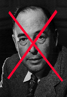
I have a twin
Conrad Scott Weems

-
I have a twin
Conrad Scott Lewis
-
I have a twin
C.S. Lewis
-
Not that C.S. Lewis
-
Not Why I'm here today
-
CSS3, HTML5, Mobile
The Ghosts of Web Design Present
-
They'll Be Important Someday
-
They'll Be Important
SomedayToday -
CSS3
-
CSS3
Is a mess, really.
-
Barely Caught Up With CSS2
-
Barely Caught Up With CSS2
(Internet Explorer)
-
Modules
-
Modules
Lots of Different Modules
-
Modules
Lots of Different Modules
40 different ones announced or worked on
-
Modules
Media Queries, Fonts, Backgrounds & Borders, Marquee
-
Yes, Marquee
-
High Priority. Candidate Recommendation
http://www.w3.org/TR/css3-marquee/
-
Opacity
-
Opacity
Rocks
-
Makes stuff opaque
-
Makes stuff opaque
Well, less opaque
(So maybe "transparency" would have made more sense.)
-
It's not like you have to try to make it opaque
-
opacity: .5;
I Like Acorns
-
Unless you're in IE. Of course.
-
IE5-7: filter:alpha(opacity=50);
I Like Acorns
-
Not so bad. But then there's IE8.
-
-ms-filter:"progid:DXImageTransform.Microsoft.Alpha(Opacity=50)";
I Like Acorns
-
That's scary
-
That's scary
It's ok, though
-
We'll be ok
You can hug the person next to you, if you need to
-
But not too closely.
They've been working all day, after all.
-
Text-Shadow
-
Lots of fun
-
text-shadow: 1px 1px 2px #333333;
I like nuts
-
You can do multiple shadows
-
text-shadow: 1px 1px 2px #00ff00, 3px 3px 2px #ff66000;
I like nuts
-
You can do a glow effect
-
text-shadow: 0px 0px 5px #ff6600;
I like nuts
-
IE? Of course not
-
So what? Still looks good
-
Remember Uncle Ben
-
Box-Shadow
-
Box-Shadow
Like text shadow, but for a ____.
-
If you guessed "cat" you may have dozed off for a moment.
-
This is my cat Fezgig
-
This is his shadow
-
That'd be cat-shadow
Which is not covered by CSS
-
It's for boxes
(Box-shadow, not cat-shadow)
-
box-shadow: 2px 2px 4px #333333;
I Don't Like Pecans
-
Was taken out of CSS3, despite being implemented.
-
Supported by Webkit and Firefox
-
Not IE, Of Course
-
Or Opera
-
So what? It still looks good.
-
Border-Radius
-
This is my main squeeze
-
Not Really
(But it makes rounded corners so easy)
-
border-radius: 10px;
I Like Peanut Butter
-moz-border-radius: 10px;
-webkit-border-radius: 10px;(Webkit could have picked a slightly smaller prefix)
-
Still No IE Or Opera
-
Still No IE Or Opera
(Of course)
-
Still no IE or Opera
(Opera 10.5 pre-alpha has it, though)
-
So what? Still looks good.
I Like Peanut Butter
-
Corner by Corner
I Like Peanut Butter
(But they're different. Of course.)
-moz-border-radius-topright: 5px
-webkit-border-top-right-radius: 5px -
Transform
-
Transform
Does lots of neat stuff
-
Transform
Does lots of neat stuff
Look it up
-
transform: rotate(90deg);
I Don't Like Chunky Peanut Butter
-
Works in... you guessed it: Webkit and Firefox
(-webkit-transform and -moz-transform, respectively)
-
IE Can Do It Too... Sort Of
-
IE Can Do It Too... Sort Of
filter: progid:DXImageTransform.Microsoft.BasicImage(rotation=1);
-
0 = 0, 1 = 90, 2 = 180, 3 = 270
-
Doesn't work at all in Opera
(C'mon Opera, give us a break)
-
Opera Comes From Norway
-
The Vikings Came From Norway
-
The vikings pillaged several areas, including but not limited to modern day: England, Ireland, Scotland, Wales, Russia, France, Spain, Portugal, Canada and Turkey.
-
Yes, Turkey
-
Just Saying.
-
(All That Said, Opera Has Transforms in 10.5 pre-alpha now)
-
@Font-Face
-
@Font-Face
It's not for faces
-
@Font-Face
It is for fonts
-
It's actually from CSS2
(but we don't need to tell anyone that)
-
Bulletproof @Font-Face Syntax
-
Bulletproof @Font-Face Syntax
Stolen from Paul Irish
-
Bulletproof @Font-Face Syntax
Stolen from Paul Irish
but that's what he gets for posting it
-
@font-face {
font-family: 'Goudy Bookletter 1911';
src: url('GoudyBookletter1911.eot');
src: local('Goudy Bookletter 1911'), url('../../presentations/refresh-2009-12/GoudyBookletter1911.otf') format ('opentype');
} -
TTF/OTF Vs EOT
-
TTF/OTF Vs EOT
Everyone allows otf or ttf fonts
-
TTF/OTF Vs EOT
Except IE, Of Course
(It does EOT)
-
Typekit
http://www.typekit.com/
(Handy. Subscription.)
-
Font Squirrel
(No Relation)
http://www.fontsquirrel.com/(Open fonts. Free. No EOT, Though)
-
League of Moveable Type
http://www.theleagueofmoveabletype.com/
(Sounds like Superheroes. Awesome Fonts)
-
&
(I totally dig this ampersand)
-
Remember Uncle Ben
-
It's Not The 90's
(Don't Bring Them Back)
-
Selectors
-
Selectors
(N = odd, even, 1, 5, 3n+1)
:only-child
:nth-child(N)
:nth-last-child(N)
:first-of-type
:last-of-type
:only-of-type
:nth-of-type(N)
:nth-last-of-type(N)
E[attribute^=value]
E[attribute$=value]
E[attribute*=value] -
Firefox, Safari, Chrome & Opera All Support This
-
Lesson?
-
Lesson?
Expecting an identical cross-browser experience means designing for lowest common denominator.
Using CSS3 (and 2.1) styles for certain features creates snazzy effects for some browsers, but still a good experience for all browsers.
-
Even IE
-
And Opera
-
And Opera
(But remember that Viking thing)
-
This Slide Intentionally Left Blank -
HTML5
-
Also A Mess
-
Currently using HTML4
-
Or XHTML1
-
Whatever
-
Whatever
The Difference is between > & />
-
Sort Of
-
Doctypes
-
Doctypes
The doctype for CSSquirrel is:
<!DOCTYPE html PUBLIC "-//W3C//DTD XHTML 1.0 Transitional//EN"
"http://www.w3.org/TR/xhtml1/DTD/xhtml1-transitional.dtd"> -
Doctypes
If it were HTML5 it'd be:
<!DOCTYPE html> -
Unsure How They'll Distinguish HTML6
-
HTML5 should be "finished" in 2022.
-
HTML5 should be "finished" in 2022.
That's 13 years away
(I'll be 45)
-
13 years ago was 1996
-
13 years ago was 1996
We were still using HTML 2.0
-
13 years ago was 1996
(This Was "Cool")
-
Despite the 2022 Date, Features Are Implemented Today
(At varying amounts depending on browser, of course)
-
The HTML5 Spec
http://dev.w3.org/html5/spec/Overview.html
This is 318,128 words long
(Roughly 1,272 pages in a standard novel format)
-
War & Peace
Is roughly 1,400 pages long
-
The HTML5 Doctor Glossary
http://html5doctor.com/glossary/
(Only 2,204 words long. About 9 pages)
-
Jeremy Keith's HTML5 Pocket Book
http://adactio.com/extras/pocketbooks/html5/
(333 words, 1 page)
-
New Semantic Constructs
-
New Semantic Constructs
Including...
<header>
For heading content. Not just for pages, but for discrete sections of pages.
<footer>
For footer sections. Also for a whole page or for discrete sections.
<audio>
For browser-based sound streaming without plugins.
<video>
For browser-based video streaming without plugins.
<nav>
For navigation sections.
<article>
For independant parts of documents, pages, applications, site.
<section>
A section of a document or application.
<aside>
For... nobody's really sure. "Tangetically related content."
-
You may have noticed "applications"
-
A Large Part of HTML5 Is Focusing on Web Applications
Instead of just Web "Pages"
-
Geolocation API
-
Works in Firefox, Chrome and Safari
(Once Again, Not IE or Opera)
-
Canvas API
-
Canvas API
var ctx = document.getElementById('canvas').getContext('2d');
ctx.save();
ctx.rotate(sec * Math.PI/30);
ctx.strokeStyle = "#D40000";
ctx.fillStyle = "#D40000";
ctx.lineWidth = 6;
ctx.beginPath();
ctx.moveTo(-30,0);
ctx.lineTo(83,0);
ctx.stroke();
ctx.beginPath();
ctx.arc(0,0,10,0,Math.PI*2,true);
ctx.fill();
ctx.beginPath();
ctx.arc(95,0,10,0,Math.PI*2,true);
ctx.stroke();
ctx.fillStyle = "#555";
ctx.arc(0,0,3,0,Math.PI*2,true);
ctx.fill();
ctx.restore();(just part of the code)
-
Bespin
-
Bespin
(No, Not That One)
-
Bespin
https://bespin.mozilla.com/
-
<audio>
<audio autobuffer>
<source src="danse.ogg" />
</audio/>
(the JS to start playing is document.getElementsByTagName("audio")[0].play();)Danse Macabre - Camille Saint-Saens
Music: Kevin MacLeod
-
<audio>
<audio controls autobuffer>
<source src="danse.ogg" />
</audio/>
-
<audio>
Safari Supports .mp3 and .wav
Firefox Supports .ogg and .wav
Chrome Supports .mp3 and .ogg
Opera Supports .wav
Internet Explorer... what do you think? -
<video>
Video is currently embedded like this
<object classid="clsid:d27cdb6e-ae6d-11cf-96b8-444553540000" width="425" height="344" codebase="http://download.macromedia.com/pub/shockwave/cabs/flash/swflash.cab#version=6,0,40,0">
<param name="allowFullScreen" value="true" />
<param name="allowscriptaccess" value="always" />
<param name="src" value="http://www.youtube.com/v/oHg5SJYRHA0&hl=en&fs=1&" />
<param name="allowfullscreen" value="true" />
<embed type="application/x-shockwave-flash" width="425" height="344" src="http://www.youtube.com/v/oHg5SJYRHA0&hl=en&fs=1&" allowscriptaccess="always" allowfullscreen="true">
</embed>
</object> -
<video>
With HTML5, It's Like This
<video controls>
<source src="billyBrowsers.ogg" />
</video> -
<video>
Safari Supports .mp4
Firefox Supports .ogg
Chrome Supports .ogg (in theory) and .mp4
Opera will have support in 10.5
Internet Explorer... Again, What Do You Think? -
The Lesson?
-
The Lesson?
HTML5, which is more application-oriented, has several great features that are already seeing support in browsers. Making use of these features will allow for some very powerful in-browser applications without the need for plugins.
Unfortunately, not all the browsers support the features yet, so you'll need Flash or Silverlight for fallback support in Internet Explorer and (in some cases) Opera. However, by making use of these features, you're helping add to a large body of work that encourages these browser makers to add support.
Even without these advanced features, though, you can start making your sites more semantically rich with the additional elements like <header> and <nav>. Making use of them in your sites now means that you'll be at the forefront of the new experiences that machine-readable semantics will offer as clever people come up with ways to take advantage of them.
-
Mobile
-
My Dad Had One Of These
-
I Don't Think It Can Browse The Web
-
You Could Knock Someone Out With It, Though
-
I Have One Of These
-
It Cannot Be Used As A Club
-
It Can Surf The Web, However
-
Well, Most of the Time
-
Our Clients Don't Need Mobile-Ready Sites Yet
-
Our Clients Don't Need Mobile-Ready Sites Yet
Right?
-
In 2010, There Will Be 1 Billion Mobile Web Users
-
In 2010, There Will Be 1 Billion Mobile Web Users
There Will Be Around 1.3 Billion PC Web Users
-
57% of Web Users Or 100%?
-
57% of Web Users Or 100%?
Which Do You Think Our Clients Want Access To?
-
Web Standards-Built Sites Will Work Fine
-
Web Standards-Built Sites Will Work Fine
Just Like They Do For Internet Explorer
-
This Is Bigger Than My Phone's Screen
-
(And Not Just Because It's On A Projector)
-
Don't Build A Design For The PC First
Then Rebuild It For Mobile
-
Well, You Can If You'd Like
-
Well, You Can If You'd Like
This Might Be The Result
-
Or This
-
This Is Opera Mini 5 Beta
-
This Is Opera Mini 4
-
Consider Your Mobile Strategy From The Beginning
-
Mobile Style Sheets
-
Mobile Style Sheets
<link rel="stylesheet" href="style.css" media="handheld" type="text/css" />
-
Mobile Style Sheets
<link rel="stylesheet" href="mobile.css" media="handheld, screen and (max-device-width: 480px)" type="text/css" />
(Since the iPhone Thinks It's a Big Boy)
-
Mobile Style Sheets
<link rel="stylesheet" href="mobile.css" media="handheld, only screen and (max-device-width: 480px)" type="text/css" />
(To Help An Anonymous Quirky Browser So It Won't Think It's Mobile)
-
Mobile Style Sheets
<link rel="stylesheet" href="mobile.css" media="handheld, only screen and (max-device-width: 480px)" type="text/css" />
<meta name="viewport" content="width = 320" />
(So The iPhone Won't Be Zoomed Out)
-
Overriding Normal Style Sheets Is A Pain
-
Overriding Normal Style Sheets Is A Pain
(Unless You Like Spending Time Undoing What You've Done)
-
Overriding Normal Style Sheets Is A Pain
(Unless Your Client Likes Spending
TimeMoney Undoing What You've Done) -
I didn't think so
-
Here's A Solution
<link rel="stylesheet" href="standard.css" media="screen and (min-device-width: 481px)" type="text/css" />
<link rel="stylesheet" href="mobile.css" media="handheld, only screen and (max-device-width: 480px)" type="text/css" />
-
Here's A Solution
<link rel="stylesheet" href="standard.css" media="screen and (min-device-width: 481px)" type="text/css" />
<link rel="stylesheet" href="mobile.css" media="handheld, only screen and (max-device-width: 480px)" type="text/css" />
(Option To Override With JS-Powered Switch)
-
Here's A Solution
<link rel="stylesheet" href="standard.css" media="screen and (min-device-width: 481px)" type="text/css" />
<link rel="stylesheet" href="mobile.css" media="handheld, only screen and (max-device-width: 480px)" type="text/css" />
(Option To Override With JS-Powered Switch)
(Save It With A Cookie)
-
There's Also Cool Server-Side Techniques
-
There's Also Cool Server-Side Techniques
(I Don't Know Them)
-
There's Also Cool Server-Side Techniques
(I'm Sure Someone Here Does)
-
There's Also Cool Server-Side Techniques
(You Could Buy Them A Beer)
-
There's Also Cool Server-Side Techniques
(Always Drink Responsibly)
-
And Tip Your Waitress
-
Lesson?
-
Lesson?
Mobile phone web users will outnumber PC web users by 2011, and are already a sizeable percentage of the web's users. If you don't start making sites to serve them now, you'll behind the curve all too soon.
The mobile web isn't just the iPhone. Get used to the different mobile browsers. (Many have emulators).
Don't try to fit a PC web design into a mobile-sized screen. Try sketching a design on a sticky note. Don't just overwrite PC styles with mobile styles.
-
-Fin-
-
-Fin-
Thanks to Mindfly For Refresh